

样式一
<style>
    :root {
        --cc-bg-color: #ffffff;
        --cc-text-color: #4a5568;
        --cc-border-color: rgba(231, 234, 243, 0.7);
        --cc-hover-bg: rgba(71, 118, 230, 0.03);
        --cc-hover-border: rgba(71, 118, 230, 0.09);
        --cc-highlight-color: #4776e6;
        --cc-card-shadow: 0 2px 12px rgba(0, 0, 0, 0.03);
        --cc-title-gradient: linear-gradient(135deg, #4776e6 0%, #8e54e9 100%);
    }

    .dark-theme {
        --cc-bg-color: #1a1b1e;
        --cc-text-color: #e4e6eb;
        --cc-border-color: rgba(255, 255, 255, 0.1);
        --cc-hover-bg: rgba(71, 118, 230, 0.1);
        --cc-hover-border: rgba(71, 118, 230, 0.2);
        --cc-highlight-color: #6d95f0;
        --cc-card-shadow: 0 2px 12px rgba(0, 0, 0, 0.15);
        --cc-title-gradient: linear-gradient(135deg, #5d8bf4 0%, #a875ff 100%);
    }

    .copyright-container {
        max-width: 800px;
        margin: 12px auto;
        font-family: 'Microsoft YaHei', sans-serif;
    }

    .copyright-box {
        background: var(--cc-bg-color);
        border-radius: 12px;
        padding: 15px 20px;
        box-shadow: var(--cc-card-shadow);
        position: relative;
        border: 1px solid var(--cc-border-color);
        transition: transform 0.3s ease, box-shadow 0.3s ease;
    }

    .copyright-box:hover {
        transform: translateY(-2px);
        box-shadow: 0 4px 20px rgba(71, 118, 230, 0.08);
    }

    .copyright-title {
        background: var(--cc-title-gradient);
        color: white;
        padding: 6px 20px;
        border-radius: 20px;
        font-size: 14px;
        font-weight: bold;
        position: absolute;
        top: -13px;
        left: 50%;
        transform: translateX(-50%);
        box-shadow: 0 2px 8px rgba(71, 118, 230, 0.15);
        letter-spacing: 1px;
        transition: all 0.3s ease;
        backdrop-filter: blur(5px);
    }

    .copyright-title::before {
        content: '';
        position: absolute;
        top: 0;
        left: 0;
        right: 0;
        bottom: 0;
        border-radius: 20px;
        background: var(--cc-title-gradient);
        opacity: 0.1;
        z-index: -1;
    }

    .copyright-item {
        display: flex;
        align-items: flex-start;
        margin: 6px 0;
        padding: 4px 8px;
        transition: all 0.3s ease;
        border-radius: 6px;
        border: 1px solid transparent;
        position: relative;
        overflow: hidden;
    }

    .copyright-item:hover {
        background: var(--cc-hover-bg);
        border: 1px solid var(--cc-hover-border);
        transform: translateX(3px);
    }

    .copyright-item:hover .item-number {
        transform: scale(1.1);
    }

    .item-number {
        background: var(--cc-title-gradient);
        color: white;
        width: 18px;
        height: 18px;
        border-radius: 4px;
        display: flex;
        align-items: center;
        justify-content: center;
        margin-right: 8px;
        font-size: 11px;
        flex-shrink: 0;
        margin-top: 1px;
        transition: transform 0.3s ease;
        position: relative;
        overflow: hidden;
    }

    .item-number::after {
        content: '';
        position: absolute;
        top: -50%;
        left: -50%;
        width: 200%;
        height: 200%;
        background: linear-gradient(transparent, rgba(255, 255, 255, 0.1), transparent);
        transform: rotate(45deg);
        transition: 0.6s;
        opacity: 0;
    }

    .copyright-item:hover .item-number::after {
        opacity: 1;
        left: 100%;
    }

    .item-content {
        color: var(--cc-text-color);
        line-height: 1.4;
        font-size: 13px;
        transition: color 0.3s ease;
    }

    .highlight {
        color: var(--cc-highlight-color);
        font-weight: bold;
        padding: 0 1px;
        position: relative;
        transition: all 0.3s ease;
    }

    .highlight::after {
        content: '';
        position: absolute;
        bottom: -1px;
        left: 0;
        width: 100%;
        height: 1px;
        background: var(--cc-highlight-color);
        transform: scaleX(0);
        transition: transform 0.3s ease;
        transform-origin: right;
        opacity: 0.5;
    }

    .copyright-item:hover .highlight::after {
        transform: scaleX(1);
        transform-origin: left;
    }

    @media (max-width: 768px) {
        .copyright-box {
            margin: 0;
            padding: 12px 15px;
        }

        .copyright-item {
            padding: 4px 6px;
        }
    }
</style>
<div class="copyright-box">
    <div class="copyright-title">版权声明</div>
    <div style="margin-top: 12px">
        <div class="copyright-item">
            <div class="item-number">1</div>
            <div class="item-content">本站名称:<span class="highlight">茉莉小栈</span></div>
        </div>
        <div class="copyright-item">
            <div class="item-number">2</div>
            <div class="item-content">本站网址:<span class="highlight">www.5iml.com</span></div>
        </div>
        <div class="copyright-item">
            <div class="item-number">3</div>
            <div class="item-content">本网站的文章部分内容可能来源于网络,仅供大家学习与参考,如有侵权,请联系站长进行删除处理。</div>
        </div>
        <div class="copyright-item">
            <div class="item-number">4</div>
            <div class="item-content">本站一切资源不代表本站立场,并不代表本站赞同其观点和对其真实性负责。</div>
        </div>
        <div class="copyright-item">
            <div class="item-number">5</div>
            <div class="item-content">本站一律禁止以任何方式发布或转载任何违法的相关信息,访客发现请向站长举报。</div>
        </div>
        <div class="copyright-item">
            <div class="item-number">6</div>
            <div class="item-content">本站附件资源、教程等内容如因时效原因失效或不可用,请评论区留言或联系站长及时更新。</div>
        </div>
    </div>
</div>
样式二
<div class="posts-copyright"><div class="entry-copyright px12">
        <span class="badg badg-sm mr3 c-yellow">1</span> 如果您喜欢本站,<a href="/" style="color:#a102ff">        <i class="wpcom-icon menu-item-icon">
                <svg aria-hidden="true"><use xlink:href="#icon-security-color"></use></svg>
            </i>点击这儿
      </a>赞助下本站,感谢支持!<br>
        <span class="badg badg-sm mr3 c-red">2</span> 可能会帮助到你:
        <a href="/" style="color:#00aeff" title="开发工具" target="_blank">
            <i class="wpcom-icon menu-item-icon">
                <svg aria-hidden="true"><use xlink:href="#icon-user-auth"></use></svg>
            </i> 开发工具
        </a> |
        <a href="/" style="color:red" title="解压资源" target="_blank">
            <i class="wpcom-icon menu-item-icon">
                <svg aria-hidden="true"><use xlink:href="#icon-ontop-color"></use></svg>
            </i> 解压资源
        </a> |
        <a href="/" style="color:#ffbe02" title="进站必看" target="_blank">
            <i class="wpcom-icon menu-item-icon">
                <svg aria-hidden="true"><use xlink:href="#icon-comment-color"></use></svg>
            </i> 进站必看
        </a><br>
      <span class="badg badg-sm mr3 c-purple">3</span> 如若转载,请注明文章出处:
        <script>var url = window.location.href;document.write(document.URL);</script></span><br>
        <span class="badg badg-sm mr3 c-blue">4</span> 本站内容观点不代表本站立场,并不代表本站赞同其观点和对其真实性负责<br>
        <span class="badg badg-sm mr3 c-green">5</span> 若作商业用途,请联系原作者授权,若本站侵犯了您的权益请
        <a href="https://wpa.qq.com/msgrd?v=3&uin=1234567&site=qq&menu=yes" style="color:red" title="联系站长qq123456" target="_blank">
            <i class="wpcom-icon menu-item-icon">
                <svg aria-hidden="true"><use xlink:href="#icon-qq-color"></use></svg>
            </i> 联系站长
        </a> 进行删除处理
        <br>
      <span class="badg badg-sm mr3">6</span> 本站所有内容均来源于网络,仅供学习与参考,请勿商业运营,严禁从事违法、侵权等任何非法活动,否则后果自负<br>
    </div></div>
样式三
<div class="single-bottom-html mg-b box b2-radius">
    <fieldset
        style="border: 8px dashed; background: #ffffff; padding: 10px; border-radius: 5px; line-height: 1.5em; color: #595959;"
        data-mce-style="border: 2px dashed; background: #ffffff; padding: 10px; border-radius: 5px; line-height: 1.5em; color: #595959;">
        <legend style="color: #ffffff; width: 30%; text-align: center; background-color: #e8b235; border-radius: 5px;"
            align="center"
            data-mce-style="color: #ffffff; width: 30%; text-align: center; background-color: #e8b235; border-radius: 8px;">
            重要声明</legend>
        <fieldset
            style="border: 1px dashed #e8b235; padding: 10px; border-radius: 5px; line-height: 2em; font-size: 12px; color: #bdbdbd; text-align: center;"
            data-mce-style="border: 1px dashed #e8b235; padding: 10px; border-radius: 5px; line-height: 2em; font-size: 12px; color: #bdbdbd; text-align: center;">
            <p style="font-size: 12px; text-align: center;" data-mce-style="font-size: 12px; text-align: center;"><span
                    style="color: #000000;" data-mce-style="color: #000000;">本站资源大多来自网络,如有侵犯你的权益请联系管理员</span><span
                    style="color: #000000;" data-mce-style="color: #000000;">E-mail:</span><span style="color: #ff6600;"
                    data-mce-style="color: #ff6600;">123456@qq.com</span> <span style="color: #000000;"
                    data-mce-style="color: #000000;">我们会第一时间进行审核删除。站内资源为网友个人学习或测试研究使用,未经原版权作者许可,禁止用于任何商业途径!请在下载24小时内删除!</span>
            </p>
            <hr>
            <p style="font-size: 12px; text-align: center;" data-mce-style="font-size: 12px; text-align: center;"><span
                    style="color: #000000;" data-mce-style="color: #000000;">如果遇到</span><span style="color: #ff0000;"
                    data-mce-style="color: #ff0000;">付费</span><span style="color: #000000;"
                    data-mce-style="color: #000000;">才可</span><span style="color: #33cccc;"
                    data-mce-style="color: #33cccc;">观看</span><span style="color: #000000;"
                    data-mce-style="color: #000000;">的文章,建议升级</span><span style="color: #ff0000;"
                    data-mce-style="color: #ff0000;">终身VIP。</span><span style="color: #000000;"
                    data-mce-style="color: #000000;">全站所有资源</span><span style="color: #ff0000;"
                    data-mce-style="color: #ff0000;">“<span style="color: #3366ff;"
                        data-mce-style="color: #3366ff;">任意下免费看</span>”。</span><span style="color: #ff9900;"
                    data-mce-style="color: #ff9900;">本站资源少部分采用</span><span style="color: #00ccff;"
                    data-mce-style="color: #00ccff;">7z压缩,</span><span style="color: #33cccc;"
                    data-mce-style="color: #33cccc;">为防止有人压缩软件不支持7z格式</span><span style="color: #cc99ff;"
                    data-mce-style="color: #cc99ff;">,7z</span><span style="color: #000000;"
                    data-mce-style="color: #000000;">解压,建议下载</span><span style="color: #cc99ff;"
                    data-mce-style="color: #cc99ff;"><em>7-zip</em></span><span style="color: #cc99ff;"
                    data-mce-style="color: #cc99ff;">,zip、rar</span><span style="color: #000000;"
                    data-mce-style="color: #000000;">解压,建议下载</span><span style="color: #cc99ff;"
                    data-mce-style="color: #cc99ff;"><em>WinRAR</em></span><span style="color: #000000;"
                    data-mce-style="color: #000000;">。</span></p>
        </fieldset>
    </fieldset>
</div>
样式四

<div class="posts-copyright"><div class="box">
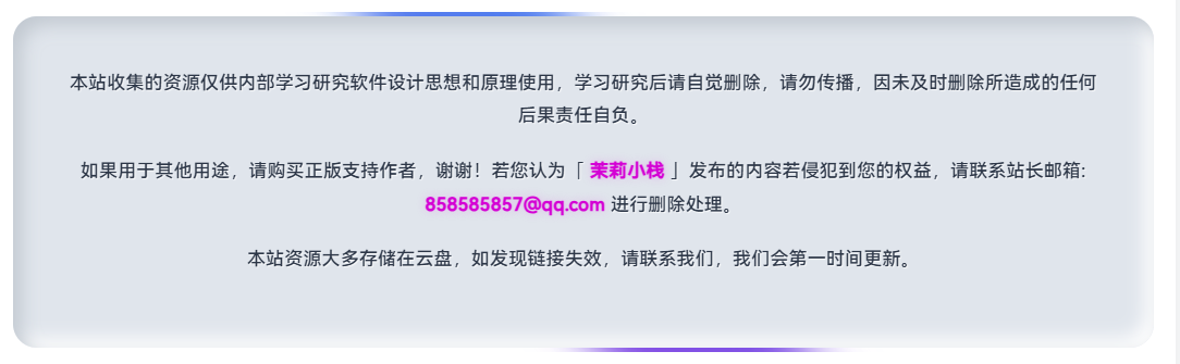
<b class="lurenfen"><p>本站收集的资源仅供内部学习研究软件设计思想和原理使用,学习研究后请自觉删除,请勿传播,因未及时删除所造成的任何后果责任自负。</p>
<p>如果用于其他用途,请购买正版支持作者,谢谢!若您认为「茉莉小栈」发布的内容若侵犯到您的权益,请联系站长邮箱:123456@qq.com 进行删除处理。</p>
本站资源大多存储在云盘,如发现链接失效,请联系我们,我们会第一时间更新。
</b>
</div>
<style type="text/css">
.box
{
position: relative;
padding: 10px;
width: 100%;
height: 100%;
display: flex;
justify-content: center;
align-items: center;
overflow: hidden;
border-radius: 20px;
}
.box:before
{
content: '';
position: absolute;
width: 150%;
height: 50%;
background: linear-gradient(315deg,#00ccff,#d400d4);
animation: animate 6s linear infinite
}
@keyframes animate
{
0%
{
transform: rotate(0deg);
}
100%
{
transform: rotate(360deg);
}
}
.box:after
{
content: '';
position: absolute;
inset : 6px;
background: var(--body-bg-color);
border-radius: 15px;
z-index: 2;
}
.lurenfen
{
position: relative;
font-weight: normal;
color: #2997f7;
z-index: 4;
margin:15px;
}
</style></div>样式五
<style>
/* 限制全局样式的作用域 */
.yykbk-copyright-container * {
margin: 0;
padding: 0;
box-sizing: border-box;
font-family: 'PingFang SC', 'Microsoft YaHei', sans-serif;
}
/* 为图标使用更具体的选择器 */
.yykbk-copyright-container .yykbk-copyright-link i {
display: inline-block;
font-style: normal;
}
.yykbk-copyright-container {
background: rgba(0, 0, 0, 0.7);
backdrop-filter: blur(10px);
border-radius: 20px;
padding: 40px;
max-width: 100%; /* 修改为100%以铺满屏幕 */
width: 100%;
box-shadow: 0 10px 30px rgba(0, 0, 0, 0.5);
position: relative;
overflow: hidden;
border: 1px solid rgba(255, 255, 255, 0.1);
margin: 20px 0; /* 修改为左右0边距,保持上下边距 */
transform-style: preserve-3d;
transition: transform 0.2s ease-out;
}
.yykbk-copyright-container::before {
content: '';
position: absolute;
top: -50%;
left: -50%;
width: 200%;
height: 200%;
background: linear-gradient(45deg,
rgba(255, 0, 150, 0.3),
rgba(0, 255, 255, 0.3),
rgba(255, 200, 0, 0.3));
z-index: -1;
animation: yykbk-rotate 15s linear infinite;
}
.yykbk-copyright-container::after {
content: '';
position: absolute;
inset: 5px;
background: rgba(10, 8, 35, 0.9);
border-radius: 16px;
z-index: -1;
}
.yykbk-copyright-header {
display: flex;
align-items: center;
justify-content: space-between;
margin-bottom: 30px;
position: relative;
}
.yykbk-logo {
display: flex;
align-items: center;
}
.yykbk-logo-icon {
width: 50px;
height: 50px;
background: linear-gradient(135deg, #6a11cb 0%, #2575fc 100%);
border-radius: 12px;
display: flex;
justify-content: center;
align-items: center;
margin-right: 15px;
font-size: 24px;
color: white;
box-shadow: 0 0 20px rgba(106, 17, 203, 0.5);
animation: yykbk-pulse 3s infinite;
position: relative;
overflow: hidden;
}
/* 为logo图标添加粒子效果 */
.yykbk-logo-icon::before {
content: '';
position: absolute;
width: 100%;
height: 100%;
background: radial-gradient(circle, rgba(255,255,255,0.3) 0%, rgba(255,255,255,0) 70%);
animation: logo-particles 4s linear infinite;
}
@keyframes logo-particles {
0% { transform: scale(0.8); opacity: 0.5; }
50% { transform: scale(1.2); opacity: 0.8; }
100% { transform: scale(0.8); opacity: 0.5; }
}
/* 超炫酷动态效果的"Yykbk优源库" */
.yykbk-logo-text {
font-size: 28px;
font-weight: bold;
display: inline-block;
position: relative;
transform-style: preserve-3d;
perspective: 1000px;
animation: float 6s ease-in-out infinite;
}
/* 主文字效果 */
.yykbk-logo-text span {
display: inline-block;
background: linear-gradient(135deg, #ff7e5f, #feb47b, #6a11cb, #2575fc);
-webkit-background-clip: text;
background-clip: text;
color: transparent;
background-size: 300% 300%;
animation: yykbk-gradient-shift 8s ease infinite;
text-shadow: 0 0 10px rgba(255, 126, 95, 0.3),
0 0 20px rgba(255, 126, 95, 0.2),
0 0 30px rgba(255, 126, 95, 0.1);
transition: all 0.3s ease;
}
/* 文字悬停效果 */
.yykbk-logo-text:hover span {
background-position: 100% 50%;
text-shadow: 0 0 15px rgba(255, 126, 95, 0.6),
0 0 30px rgba(255, 126, 95, 0.4),
0 0 45px rgba(255, 126, 95, 0.2);
}
/* 霓虹光效 */
.yykbk-logo-text::before {
content: attr(data-text);
position: absolute;
top: 0;
left: 0;
width: 100%;
height: 100%;
color: #ff7e5f;
filter: blur(10px);
opacity: 0.5;
z-index: -1;
animation: neon-pulse 2s ease-in-out infinite alternate;
}
@keyframes neon-pulse {
from { opacity: 0.3; filter: blur(8px); }
to { opacity: 0.7; filter: blur(12px); }
}
/* 粒子环绕效果 */
.yykbk-logo-text::after {
content: '';
position: absolute;
top: -10px;
left: -10px;
width: calc(100% + 20px);
height: calc(100% + 20px);
border: 2px solid rgba(255, 126, 95, 0.2);
border-radius: 8px;
animation: border-pulse 4s ease-in-out infinite;
box-shadow: 0 0 15px rgba(255, 126, 95, 0.1);
}
@keyframes border-pulse {
0% { transform: scale(1); border-color: rgba(255, 126, 95, 0.2); }
50% { transform: scale(1.05); border-color: rgba(255, 126, 95, 0.4); }
100% { transform: scale(1); border-color: rgba(255, 126, 95, 0.2); }
}
/* 3D浮动效果 */
@keyframes float {
0% { transform: translateY(0px) rotateX(0deg) rotateY(0deg); }
25% { transform: translateY(-5px) rotateX(2deg) rotateY(-2deg); }
50% { transform: translateY(0px) rotateX(0deg) rotateY(0deg); }
75% { transform: translateY(5px) rotateX(-2deg) rotateY(2deg); }
100% { transform: translateY(0px) rotateX(0deg) rotateY(0deg); }
}
/* 粒子动画 */
.yykbk-particles {
position: absolute;
width: 100%;
height: 100%;
pointer-events: none;
z-index: 0;
}
.yykbk-particle {
position: absolute;
background: rgba(255, 126, 95, 0.6);
border-radius: 50%;
animation: particle-move 10s linear infinite;
}
@keyframes particle-move {
0% { transform: translate(0, 0); opacity: 0; }
10% { opacity: 0.8; }
90% { opacity: 0.8; }
100% { transform: translate(var(--x), var(--y)); opacity: 0; }
}
.yykbk-copyright-content {
color: rgba(255, 255, 255, 0.85);
line-height: 1.8;
font-size: 16px;
text-align: justify;
position: relative;
z-index: 2;
}
.yykbk-copyright-content p {
margin-bottom: 15px;
/* 取消3D文字效果,保留淡入动画 */
animation: content-fade-in 1s ease-out forwards;
opacity: 0;
transform: translateY(10px);
transition: all 0.3s ease;
}
.yykbk-copyright-content p:hover {
transform: translateY(-2px);
color: rgba(255, 255, 255, 1);
}
.yykbk-copyright-content p:nth-child(1) { animation-delay: 0.1s; }
.yykbk-copyright-content p:nth-child(2) { animation-delay: 0.2s; }
.yykbk-copyright-content p:nth-child(3) { animation-delay: 0.3s; }
@keyframes content-fade-in {
to {
opacity: 1;
transform: translateY(0);
}
}
.yykbk-highlight {
color: #ff7e5f;
font-weight: bold;
text-shadow: 0 0 10px rgba(255, 126, 95, 0);
transition: text-shadow 0.3s ease;
/* 为高亮文本添加脉动效果 */
animation: highlight-pulse 2s infinite alternate;
}
@keyframes highlight-pulse {
from { text-shadow: 0 0 5px rgba(255, 126, 95, 0.5); }
to { text-shadow: 0 0 15px rgba(255, 126, 95, 0.8); }
}
.yykbk-highlight:hover {
text-shadow: 0 0 10px rgba(255, 126, 95, 0.8);
}
.yykbk-copyright-links {
display: flex;
justify-content: center;
margin-top: 30px;
flex-wrap: wrap;
gap: 15px;
}
.yykbk-copyright-link {
position: relative;
overflow: hidden;
background: rgba(255, 255, 255, 0.1);
border: 1px solid rgba(255, 255, 255, 0.2);
color: white;
padding: 10px 20px;
border-radius: 50px;
text-decoration: none;
font-weight: 500;
transition: all 0.3s ease;
display: flex;
align-items: center;
gap: 8px;
/* 为按钮添加光晕效果 */
box-shadow: 0 0 10px rgba(255, 255, 255, 0.1);
/* 为按钮添加背景渐变 */
background: linear-gradient(135deg, rgba(255, 255, 255, 0.1), rgba(255, 255, 255, 0.05));
}
/* 为不同按钮设置不同的颜色主题 */
.yykbk-copyright-link:nth-child(1) {
border-color: rgba(106, 17, 203, 0.5);
background: linear-gradient(135deg, rgba(106, 17, 203, 0.1), rgba(37, 117, 252, 0.1));
}
.yykbk-copyright-link:nth-child(2) {
border-color: rgba(0, 255, 255, 0.5);
background: linear-gradient(135deg, rgba(0, 255, 255, 0.1), rgba(0, 150, 255, 0.1));
}
.yykbk-copyright-link:nth-child(3) {
border-color: rgba(255, 200, 0, 0.5);
background: linear-gradient(135deg, rgba(255, 200, 0, 0.1), rgba(255, 150, 0, 0.1));
}
.yykbk-copyright-link:nth-child(4) {
border-color: rgba(255, 0, 150, 0.5);
background: linear-gradient(135deg, rgba(255, 0, 150, 0.1), rgba(200, 0, 255, 0.1));
}
/* 为按钮添加闪光效果 */
.yykbk-copyright-link::before {
content: '';
position: absolute;
top: -50%;
left: -50%;
width: 200%;
height: 200%;
background: linear-gradient(
to right,
rgba(255, 255, 255, 0) 0%,
rgba(255, 255, 255, 0.2) 50%,
rgba(255, 255, 255, 0) 100%
);
transform: rotate(30deg);
animation: shine 3s infinite;
}
@keyframes shine {
0% { transform: translateX(-100%) rotate(30deg); }
100% { transform: translateX(100%) rotate(30deg); }
}
.yykbk-copyright-link:hover {
transform: translateY(-3px);
box-shadow: 0 5px 15px rgba(255, 255, 255, 0.2);
}
/* 为图标添加旋转和放大效果 */
.yykbk-copyright-link i {
transition: transform 0.5s ease;
}
.yykbk-copyright-link:hover i {
transform: rotate(360deg) scale(1.2);
}
.yykbk-copyright-footer {
margin-top: 30px;
text-align: center;
color: rgba(255, 255, 255, 0.6);
font-size: 14px;
display: flex;
justify-content: center;
align-items: center;
gap: 10px;
flex-wrap: wrap;
position: relative;
overflow: hidden;
padding: 10px;
border-radius: 8px;
}
/* 为页脚添加背景和发光效果 */
.yykbk-copyright-footer::before {
content: '';
position: absolute;
top: 0;
left: 0;
width: 100%;
height: 100%;
background: linear-gradient(90deg, rgba(255, 255, 255, 0.02), rgba(255, 255, 255, 0.05), rgba(255, 255, 255, 0.02));
z-index: -1;
animation: footer-glow 4s infinite;
}
@keyframes footer-glow {
0%, 100% { background-position: -100% 0; }
50% { background-position: 100% 0; }
}
/* 为页脚文本添加动态效果 */
.yykbk-copyright-footer span {
position: relative;
transition: all 0.3s ease;
padding: 5px 10px;
}
.yykbk-copyright-footer span:hover {
color: white;
transform: translateY(-2px);
}
/* 为页脚分隔符添加闪烁效果 */
.yykbk-copyright-footer span:nth-child(odd) {
color: rgba(255, 255, 255, 0.3);
animation: blink 2s infinite;
}
@keyframes blink {
0%, 100% { opacity: 0.3; }
50% { opacity: 0.8; }
}
/* 为备案号添加特殊效果 */
.yykbk-copyright-footer span:nth-child(3) {
color: #2575fc;
text-shadow: 0 0 10px rgba(37, 117, 252, 0.5);
}
/* 为"优源官方"添加特殊效果 */
.yykbk-copyright-footer span:nth-child(5) {
color: #ff7e5f;
text-shadow: 0 0 10px rgba(255, 126, 95, 0.5);
}
/* 为页脚添加底部发光效果 */
.yykbk-copyright-footer::after {
content: '';
position: absolute;
bottom: 0;
left: 0;
width: 100%;
height: 2px;
background: linear-gradient(90deg,
rgba(106, 17, 203, 0),
rgba(106, 17, 203, 0.5),
rgba(37, 117, 252, 0.5),
rgba(0, 255, 255, 0.5),
rgba(255, 200, 0, 0.5),
rgba(255, 126, 95, 0.5),
rgba(255, 0, 150, 0.5),
rgba(106, 17, 203, 0)
);
background-size: 200% 100%;
animation: footer-line 10s linear infinite;
}
@keyframes footer-line {
0% { background-position: -200% 0; }
100% { background-position: 200% 0; }
}
.yykbk-copyright-badge {
background: linear-gradient(45deg, #ff7e5f, #feb47b);
color: #000;
padding: 3px 10px;
border-radius: 5px;
font-weight: bold;
font-size: 12px;
letter-spacing: 1px;
}
@keyframes yykbk-rotate {
0% { transform: rotate(0deg); }
100% { transform: rotate(360deg); }
}
@keyframes yykbk-pulse {
0% { box-shadow: 0 0 0 0 rgba(106, 17, 203, 0.7); }
70% { box-shadow: 0 0 0 10px rgba(106, 17, 203, 0); }
100% { box-shadow: 0 0 0 0 rgba(106, 17, 203, 0); }
}
@keyframes yykbk-gradient-shift {
0% { background-position: 0% 50%; }
50% { background-position: 100% 50%; }
100% { background-position: 0% 50%; }
}
.yykbk-decoration {
position: absolute;
z-index: 1;
opacity: 0.4;
}
.yykbk-decoration.circle {
width: 100px;
height: 100px;
border: 3px solid #ff7e5f;
border-radius: 50%;
top: -40px;
right: -40px;
animation: yykbk-rotate 30s linear infinite;
}
.yykbk-decoration.triangle {
width: 0;
height: 0;
border-left: 50px solid transparent;
border-right: 50px solid transparent;
border-bottom: 100px solid #2575fc;
bottom: -50px;
left: -50px;
transform: rotate(45deg);
animation: yykbk-rotate 25s linear infinite reverse;
}
/* 3D倾斜效果 - 使用CSS而非JavaScript */
.yykbk-copyright-container {
transition: transform 0.5s cubic-bezier(0.25, 0.46, 0.45, 0.94);
}
.yykbk-copyright-container:hover {
transform: perspective(1000px) rotateY(2deg) rotateX(-2deg);
}
/* 响应式设计 */
@media (max-width: 768px) {
.yykbk-copyright-container {
padding: 30px 20px;
}
.yykbk-copyright-header {
flex-direction: column;
text-align: center;
gap: 20px;
}
.yykbk-logo {
justify-content: center;
}
.yykbk-logo-text {
font-size: 24px;
}
.yykbk-copyright-content {
font-size: 14px;
}
.yykbk-copyright-footer {
font-size: 12px;
}
}
</style>
<div class="yykbk-copyright-container">
<!-- 装饰元素 -->
<div class="yykbk-decoration circle"></div>
<div class="yykbk-decoration triangle"></div>
<div class="yykbk-copyright-header">
<div class="yykbk-logo">
<div class="yykbk-logo-icon">M</div>
<div class="yykbk-logo-text" data-text="有事没事常联系-茉莉">
<span>茉莉-注-统一解压密码-www.5iml.com</span>
</div>
</div>
<div class="yykbk-copyright-badge">版权声明</div>
</div>
<div class="yykbk-copyright-content">
<p><span class="yykbk-highlight">茉莉小栈</span>本网站所有内容,包括但不限于文字、图片、音频、视频、软件、程序、以及网页版式设计等。</p>
<p>本网站部分内容转载自互联网,转载目的在于传递更多信息,并不代表本网站赞同其观点和对其真实性负责。如有侵权行为,请联系我们,我们将及时处理。</p>
<p>对于用户通过本网站上传、发布或传送的任何内容,用户应保证其为著作权人或已取得合法授权,并且该内容不会侵犯任何第三方的合法权益。如果第三方提出关于著作权的异议,本网站有权删除相关的内容并保留追究用户法律责任的权利。</p>
</div>
<div class="yykbk-copyright-links">
<a href="#" class="yykbk-copyright-link">
<i>📝</i> 版权政策
</a>
<a href="#" class="yykbk-copyright-link">
<i>🔒</i> 隐私协议
</a>
<a href="#" class="yykbk-copyright-link">
<i>📩</i> 联系我们
</a>
<a href="#" class="yykbk-copyright-link">
<i>⚖️</i> 侵权举报
</a>
</div>
<div class="yykbk-copyright-footer">
<span>© 2025</span>
<span>茉莉小栈 版权所有</span>
<span>|</span>
<span>备案号: 皖ICP备2025078946号-2</span>
<span>|</span>
<span>官方:茉莉小栈</span>
</div>
</div>
<script>
// 简化的文字动画效果
document.addEventListener('DOMContentLoaded', function() {
const highlights = document.querySelectorAll('.yykbk-copyright-container .yykbk-highlight');
// 现在使用纯CSS实现高亮效果
// 为"Yykbk优源库"创建粒子效果
createParticles();
});
// 创建粒子效果
function createParticles() {
const container = document.querySelector('.yykbk-copyright-header');
if (!container) return;
// 创建粒子容器
const particlesContainer = document.createElement('div');
particlesContainer.className = 'yykbk-particles';
container.appendChild(particlesContainer);
// 创建10个粒子
for (let i = 0; i < 10; i++) {
const particle = document.createElement('div');
particle.className = 'yykbk-particle';
// 设置粒子大小
const size = Math.random() * 4 + 1;
particle.style.width = `${size}px`;
particle.style.height = `${size}px`;
// 设置粒子初始位置
const logoRect = document.querySelector('.yykbk-logo-text').getBoundingClientRect();
const containerRect = container.getBoundingClientRect();
// 计算相对位置
const left = logoRect.left - containerRect.left + Math.random() * logoRect.width;
const top = logoRect.top - containerRect.top + Math.random() * logoRect.height;
particle.style.left = `${left}px`;
particle.style.top = `${top}px`;
// 设置粒子运动目标位置
const x = (Math.random() - 0.5) * 200;
const y = (Math.random() - 0.5) * 200;
particle.style.setProperty('--x', `${x}px`);
particle.style.setProperty('--y', `${y}px`);
// 设置粒子颜色
const colors = ['rgba(255, 126, 95, 0.6)', 'rgba(255, 180, 119, 0.6)', 'rgba(106, 17, 203, 0.6)', 'rgba(37, 117, 252, 0.6)'];
const color = colors[Math.floor(Math.random() * colors.length)];
particle.style.background = color;
// 设置粒子动画延迟
particle.style.animationDelay = `${Math.random() * 10}s`;
particlesContainer.appendChild(particle);
}
}
</script>样式六
<div class="posts-copyright">
    <div class="posts-copyright">
        <div class="copyright-wrapper">
            <div class="copyright-box">
                <div class="copyright-content">
                    <p>
                        本站收集的资源仅供内部学习研究软件设计思想和原理使用,学习研究后请自觉删除,请勿传播,因未及时删除所造成的任何后果责任自负。
                    </p>
                    <p>
                        如果用于其他用途,请购买正版支持作者,谢谢!若您认为「
                        <span class="copyright-highlight">
                            茉莉小栈
                        </span>
                        」发布的内容若侵犯到您的权益,请联系站长邮箱:
                        <span class="copyright-highlight">
                            858585857@qq.com
                        </span>
                        进行删除处理。
                    </p>
                    <p>
                        本站资源大多存储在云盘,如发现链接失效,请联系我们,我们会第一时间更新。
                    </p>
                </div>
            </div>
        </div>
        <style>
            .copyright-container {
            width: 100%;
            max-width: 800px;
            padding: 30px;
        }
        .copyright-title {
            text-align: center;
            margin-bottom: 30px;
            color: #4a5568;
            font-weight: 600;
            text-shadow: 2px 2px 4px rgba(163,177,198,0.4),
                         -2px -2px 4px rgba(255,255,255,0.8);
            font-size: 32px;
            letter-spacing: 1px;
        }
        .copyright-wrapper {
            margin: 30px 0;
            perspective: 1000px;
        }
        .copyright-box {
            position: relative;
            padding: 30px;
            width: 100%;
            display: flex;
            justify-content: center;
            align-items: center;
            overflow: hidden;
            border-radius: 25px;
            transition: all 0.4s cubic-bezier(0.175, 0.885, 0.32, 1.275);
        }
        .copyright-box:hover {
            transform: translateY(-8px);
            box-shadow: 0 15px 30px rgba(0, 0, 0, 0.1);
        }
        .copyright-box:before {
            content: '';
            position: absolute;
            width: 150%;
            height: 50%;
            background: linear-gradient(315deg, #00ccff, #d400d4);
            animation: copyright-animation 6s linear infinite;
            filter: blur(20px);
        }
        @keyframes copyright-animation {
            0% {
                transform: rotate(0deg);
            }
            100% {
                transform: rotate(360deg);
            }
        }
        .copyright-box:after {
            content: '';
            position: absolute;
            inset: 4px;
            background: #e0e5ec;
            border-radius: 22px;
            z-index: 2;
            box-shadow: inset 8px 8px 16px #c2c9d1,
                        inset -8px -8px 16px #ffffff;
        }
        .copyright-content {
            position: relative;
            font-weight: normal;
            color: #2d3748;
            z-index: 4;
            padding: 20px;
            font-size: 17px;
            line-height: 1.8;
            text-align: center;
        }
        .copyright-content p {
            margin-bottom: 20px;
            text-shadow: 1px 1px 1px rgba(255,255,255,0.8);
        }
        .copyright-content strong {
            color: #d400d4;
            font-weight: 600;
        }
        .copyright-footer {
            text-align: center;
            margin-top: 30px;
            color: #718096;
            font-size: 14px;
            text-shadow: 1px 1px 1px rgba(255,255,255,0.8);
            padding: 12px 20px;
            border-radius: 15px;
            background: #e0e5ec;
            box-shadow: 8px 8px 16px #c2c9d1,
                       -8px -8px 16px #ffffff;
            display: inline-block;
        }
        @media (max-width: 600px) {
            .copyright-container {
                padding: 15px;
            }
            .copyright-box {
                padding: 20px;
            }
            .copyright-content {
                padding: 15px;
                font-size: 15px;
            }
            .copyright-title {
                font-size: 26px;
            }
        }
        .copyright-highlight {
            color: #d400d4;
            font-weight: 700;
            text-shadow: 0 0 8px rgba(212, 0, 212, 0.2);
        }
        .copyright-icon {
            display: inline-block;
            margin-right: 8px;
            font-size: 20px;
            vertical-align: middle;
        }
        </style>
    </div>
</div>
<style>
        .copyright-container {
            width: 100%;
            max-width: 800px;
            padding: 30px;
        }

        .copyright-title {
            text-align: center;
            margin-bottom: 30px;
            color: #4a5568;
            font-weight: 600;
            text-shadow: 2px 2px 4px rgba(163,177,198,0.4),
                         -2px -2px 4px rgba(255,255,255,0.8);
            font-size: 32px;
            letter-spacing: 1px;
        }

        .copyright-wrapper {
            margin: 30px 0;
            perspective: 1000px;
        }

        .copyright-box {
            position: relative;
            padding: 30px;
            width: 100%;
            display: flex;
            justify-content: center;
            align-items: center;
            overflow: hidden;
            border-radius: 25px;
            transition: all 0.4s cubic-bezier(0.175, 0.885, 0.32, 1.275);
        }

        .copyright-box:hover {
            transform: translateY(-8px);
            box-shadow: 0 15px 30px rgba(0, 0, 0, 0.1);
        }

        .copyright-box:before {
            content: '';
            position: absolute;
            width: 150%;
            height: 50%;
            background: linear-gradient(315deg, #00ccff, #d400d4);
            animation: copyright-animation 6s linear infinite;
            filter: blur(20px);
        }

        @keyframes copyright-animation {
            0% {
                transform: rotate(0deg);
            }
            100% {
                transform: rotate(360deg);
            }
        }

        .copyright-box:after {
            content: '';
            position: absolute;
            inset: 4px;
            background: #e0e5ec;
            border-radius: 22px;
            z-index: 2;
            box-shadow: inset 8px 8px 16px #c2c9d1,
                        inset -8px -8px 16px #ffffff;
        }

        .copyright-content {
            position: relative;
            font-weight: normal;
            color: #2d3748;
            z-index: 4;
            padding: 20px;
            font-size: 17px;
            line-height: 1.8;
            text-align: center;
        }

        .copyright-content p {
            margin-bottom: 20px;
            text-shadow: 1px 1px 1px rgba(255,255,255,0.8);
        }

        .copyright-content strong {
            color: #d400d4;
            font-weight: 600;
        }

        .copyright-footer {
            text-align: center;
            margin-top: 30px;
            color: #718096;
            font-size: 14px;
            text-shadow: 1px 1px 1px rgba(255,255,255,0.8);
            padding: 12px 20px;
            border-radius: 15px;
            background: #e0e5ec;
            box-shadow: 8px 8px 16px #c2c9d1,
                       -8px -8px 16px #ffffff;
            display: inline-block;
        }

        @media (max-width: 600px) {
            .copyright-container {
                padding: 15px;
            }

            .copyright-box {
                padding: 20px;
            }

            .copyright-content {
                padding: 15px;
                font-size: 15px;
            }

            .copyright-title {
                font-size: 26px;
            }
        }

        .copyright-highlight {
            color: #d400d4;
            font-weight: 700;
            text-shadow: 0 0 8px rgba(212, 0, 212, 0.2);
        }

        .copyright-icon {
            display: inline-block;
            margin-right: 8px;
            font-size: 20px;
            vertical-align: middle;
        }
    </style>
样式七
<style>
.custom_notice_wrapper_20240712 {
width: 100%;
margin: 20px 0;
animation: custom_notice_fadein_20240712 0.8s ease-in-out;
font-family: "PingFang SC", "Microsoft YaHei", sans-serif;
}
.custom_notice_container_20240712 {
display: flex;
background: linear-gradient(135deg, #4361ee, #3a0ca3, #7209b7, #4cc9f0);
background-size: 300% 300%;
animation: custom_notice_gradient_20240712 15s ease infinite;
color: white;
padding: 20px;
border-radius: 12px;
box-sizing: border-box;
width: 100%;
box-shadow: 0 4px 20px rgba(66, 99, 235, 0.5);
transition: all 0.4s cubic-bezier(0.175, 0.885, 0.32, 1.275);
position: relative;
overflow: hidden;
border: 1px solid rgba(255, 255, 255, 0.2);
align-items: flex-start;
}
.custom_notice_container_20240712:hover {
transform: translateY(-3px) scale(1.01);
box-shadow: 0 6px 25px rgba(66, 99, 235, 0.6);
border: 1px solid rgba(255, 255, 255, 0.4);
}
.custom_notice_container_20240712::before {
content: "";
position: absolute;
top: 0;
left: -100%;
width: 100%;
height: 100%;
background: linear-gradient(90deg, transparent, rgba(255, 255, 255, 0.2), transparent);
animation: custom_notice_shine_20240712 3s infinite;
}
.custom_notice_icon_wrapper_20240712 {
position: relative;
margin-right: 20px;
flex-shrink: 0;
margin-top: 5px;
}
.custom_notice_icon_20240712 {
background: linear-gradient(135deg, #f72585, #b5179e);
color: white;
font-weight: bold;
width: 40px;
height: 40px;
border-radius: 10px;
display: flex;
justify-content: center;
align-items: center;
position: relative;
z-index: 2;
box-shadow: 0 3px 10px rgba(0, 0, 0, 0.2);
transition: all 0.4s ease;
border: 2px solid rgba(255, 255, 255, 0.3);
font-size: 14px;
}
.custom_notice_container_20240712:hover .custom_notice_icon_20240712 {
transform: rotate(15deg) scale(1.1);
box-shadow: 0 5px 15px rgba(0, 0, 0, 0.3);
}
.custom_notice_pulse_20240712 {
position: absolute;
top: -2px;
left: -2px;
right: -2px;
bottom: -2px;
border-radius: 10px;
background: linear-gradient(135deg, #f72585, #4361ee);
z-index: 1;
opacity: 0.7;
animation: custom_notice_pulse_20240712 2s infinite;
}
.custom_notice_content_20240712 {
flex: 1;
position: relative;
z-index: 2;
}
.custom_notice_title_20240712 {
font-size: 18px;
font-weight: bold;
margin-bottom: 12px;
text-shadow: 0 2px 4px rgba(0, 0, 0, 0.2);
letter-spacing: 1px;
}
.custom_notice_list_20240712 {
list-style: none;
padding: 0;
margin: 0;
}
.custom_notice_list_20240712 li {
margin-bottom: 10px;
display: flex;
align-items: flex-start;
line-height: 1.5;
font-size: 14px;
text-shadow: 0 1px 2px rgba(0, 0, 0, 0.2);
}
.custom_notice_number_20240712 {
display: inline-flex;
justify-content: center;
align-items: center;
width: 22px;
height: 22px;
border-radius: 50%;
margin-right: 10px;
font-weight: bold;
font-size: 12px;
flex-shrink: 0;
box-shadow: 0 2px 5px rgba(0, 0, 0, 0.15);
margin-top: 1px;
}
.custom_notice_number_20240712.n1 {
background: linear-gradient(135deg, #ff9a8b, #ff6a88);
}
.custom_notice_number_20240712.n2 {
background: linear-gradient(135deg, #ffd166, #ff9e40);
}
.custom_notice_number_20240712.n3 {
background: linear-gradient(135deg, #06d6a0, #1b9aaa);
}
.custom_notice_number_20240712.n4 {
background: linear-gradient(135deg, #118ab2, #073b4c);
}
.custom_notice_number_20240712.n5 {
background: linear-gradient(135deg, #8338ec, #3a86ff);
}
.custom_notice_number_20240712.n6 {
background: linear-gradient(135deg, #ef476f, #bc4b51);
}
.custom_notice_particles_20240712 {
position: absolute;
top: 0;
left: 0;
width: 100%;
height: 100%;
overflow: hidden;
z-index: 1;
}
.custom_notice_particles_20240712::before,
.custom_notice_particles_20240712::after {
content: "";
position: absolute;
width: 10px;
height: 10px;
border-radius: 50%;
background-color: rgba(255, 255, 255, 0.3);
animation: custom_notice_float_20240712 6s infinite;
}
.custom_notice_particles_20240712::before {
top: 20%;
left: 10%;
animation-delay: 0s;
}
.custom_notice_particles_20240712::after {
top: 60%;
left: 80%;
width: 15px;
height: 15px;
animation-delay: 2s;
}
@keyframes custom_notice_gradient_20240712 {
0% { background-position: 0% 50%; }
50% { background-position: 100% 50%; }
100% { background-position: 0% 50%; }
}
@keyframes custom_notice_fadein_20240712 {
from { opacity: 0; transform: translateY(15px); }
to { opacity: 1; transform: translateY(0); }
}
@keyframes custom_notice_pulse_20240712 {
0% { transform: scale(1); opacity: 0.7; }
50% { transform: scale(1.6); opacity: 0; }
100% { transform: scale(1); opacity: 0; }
}
@keyframes custom_notice_shine_20240712 {
0% { left: -100%; }
20% { left: 100%; }
100% { left: 100%; }
}
@keyframes custom_notice_float_20240712 {
0% { transform: translateY(0) translateX(0); opacity: 0; }
20% { opacity: 0.8; }
80% { opacity: 0.2; }
100% { transform: translateY(-100px) translateX(20px); opacity: 0; }
}
@media (max-width: 768px) {
.custom_notice_container_20240712 {
flex-direction: column;
padding: 15px;
}
.custom_notice_icon_wrapper_20240712 {
margin-right: 0;
margin-bottom: 15px;
align-self: center;
}
.custom_notice_title_20240712 {
text-align: center;
}
}
</style>
<div class="custom_notice_wrapper_20240712">
<div class="custom_notice_container_20240712">
<div class="custom_notice_icon_wrapper_20240712">
<div class="custom_notice_icon_20240712">声明</div>
<div class="custom_notice_pulse_20240712"></div>
</div>
<div class="custom_notice_content_20240712">
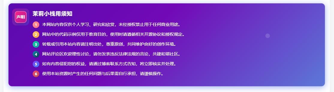
<div class="custom_notice_title_20240712">茉莉小栈使用须知</div>
<ul class="custom_notice_list_20240712">
<li><span class="custom_notice_number_20240712 n1">1</span>本网站内容仅供个人学习、研究和欣赏,未经授权禁止用于任何商业用途。</li>
<li><span class="custom_notice_number_20240712 n2">2</span>网站中的代码示例仅用于教育目的,使用时请遵循相关开源协议和授权规定。</li>
<li><span class="custom_notice_number_20240712 n3">3</span>转载或引用本站内容请注明出处,尊重原创,共同维护良好的创作环境。</li>
<li><span class="custom_notice_number_20240712 n4">4</span>网站评论区欢迎理性讨论,请勿发表违反法律法规的言论,共建和谐社区。</li>
<li><span class="custom_notice_number_20240712 n5">5</span>如有内容侵犯您的权益,请通过博客联系方式告知,将立即核实并处理。</li>
<li><span class="custom_notice_number_20240712 n6">6</span>使用本站资源时产生的任何问题与后果需自行承担,请谨慎操作。</li>
</ul>
</div>
<div class="custom_notice_particles_20240712"></div>
</div>
</div>


 QQ
QQ


这一切,似未曾拥有